Skip to content

Your homepage has seconds to impress in 2025, attention spans are shorter than ever. You have just seconds to make a connection, build trust, and guide them toward that first click. A beautiful Shopify homepage isn’t just about aesthetics; it’s a strategic tool that can shape the entire customer journey.
You might think homepage design is all about colors and fonts. But what truly matters? Structure, messaging, clarity, speed, and emotion. In this article, we’ll walk through the design secrets that successful Shopify stores use to hold attention, guide action, and drive revenue. Whether you’re a startup or scaling fast, these ideas can transform bounce into buy.
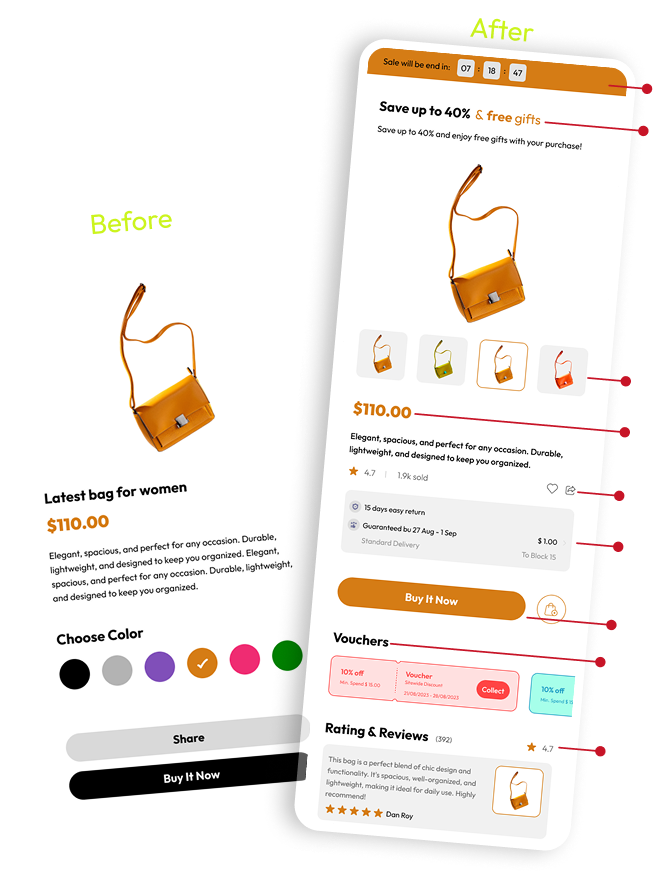
1. Above-the-Fold Design That Captures Attention
When someone lands on your homepage, the “above-the-fold” section is the first thing they see. It’s your storefront’s handshake. If it doesn’t feel clear, inviting, and relevant, visitors scroll away or worse, bounce.
Make your hero banner purposeful. A headline that speaks to pain points, a product visual that evokes emotion, and a single, clear CTA can dramatically increase dwell time.
Checklist:
- Clear headline (no vague slogans)
- Visual that relates to product use or identity
- CTA button: contrasting, specific (“Shop New Arrivals”)
Wrap-Up: First impressions matter. Design your hero like it’s your brand’s elevator pitch.
2. Use CTAs That Guide User Behavior
CTAs aren’t just buttons. They’re the nudges that tell users what to do next. In 2025, the best Shopify stores use CTAs like road signs. They simplify decisions and reduce user hesitation.
Avoid the generic “Learn More.” Instead, write like a human: “Grab Yours Before It’s Gone” or “Find Your Fit.”
CTA Strategy:
- Place primary CTA above the fold
- Use action-driven, benefit-focused language
- Repeat strategically through the scroll (but don’t overwhelm)
Wrap-Up: CTAs aren’t annoying when they’re useful. Give your user permission to act.
3. Visual Storytelling With Media
A product photo is good. A lifestyle photo? Better. But a visual that tells a story? That’s what sticks. Your homepage should showcase your brand’s vibe, values, and value fast.
Consider short video loops, carousel product highlights, or animated gifs. Visuals should support, not distract.
Pro Tips:
- Use compressed, high-res images to protect page speed
- Feature happy customers or real use cases
- Add subtle motion to draw focus
Wrap-Up: Show more than you tell. Storytelling begins before a single word is read.
4. Add Trust Elements & Social Proof
It doesn’t matter how pretty your homepage is if visitors don’t trust you. Displaying credibility markers directly on the homepage can make or break conversion.
Trust signals include review snippets, star ratings, client logos, and press features. Testimonials should feel real, with faces and names.
Ideas That Work:
- “As seen in” media mentions bar
- 5-star reviews or UGC slideshow
- Fast shipping & secure checkout icons
Wrap-Up: Shoppers buy from brands they believe in. Your homepage must quietly prove you’re legit.
5. Accessibility and Mobile-First UX
The majority of your visitors are coming from mobile, and many might be differently abled. Inclusive design isn’t optional in 2025 it’s part of good business.
Whether you’re building from scratch or optimizing an existing Shopify Store design, accessibility should lead your strategy. Use legible fonts, strong color contrast, and keyboard-friendly navigation. Your site should feel just as powerful in one hand as it does on a desktop.
Quick Fixes:
- Use alt text and semantic headings
- Design with touch-friendly spacing
- Test your site with screen readers
Wrap-Up: A beautiful homepage isn’t beautiful if it’s not accessible.
6. Highlight Best Sellers & Offers
Visitors often land on your homepage with one question: “What should I buy?” Don’t make them dig. Spotlight your top-performing products or curated categories.
Use urgency without pressure. Flash sales, limited stock banners, or popular product sections work well.
Layout Tips:
- Use tiles or cards for easy browsing
- Add reviews or “most loved” labels
- Keep CTAs close to product visuals
Wrap-Up: Guide attention toward what’s working. Let popular items do the convincing.
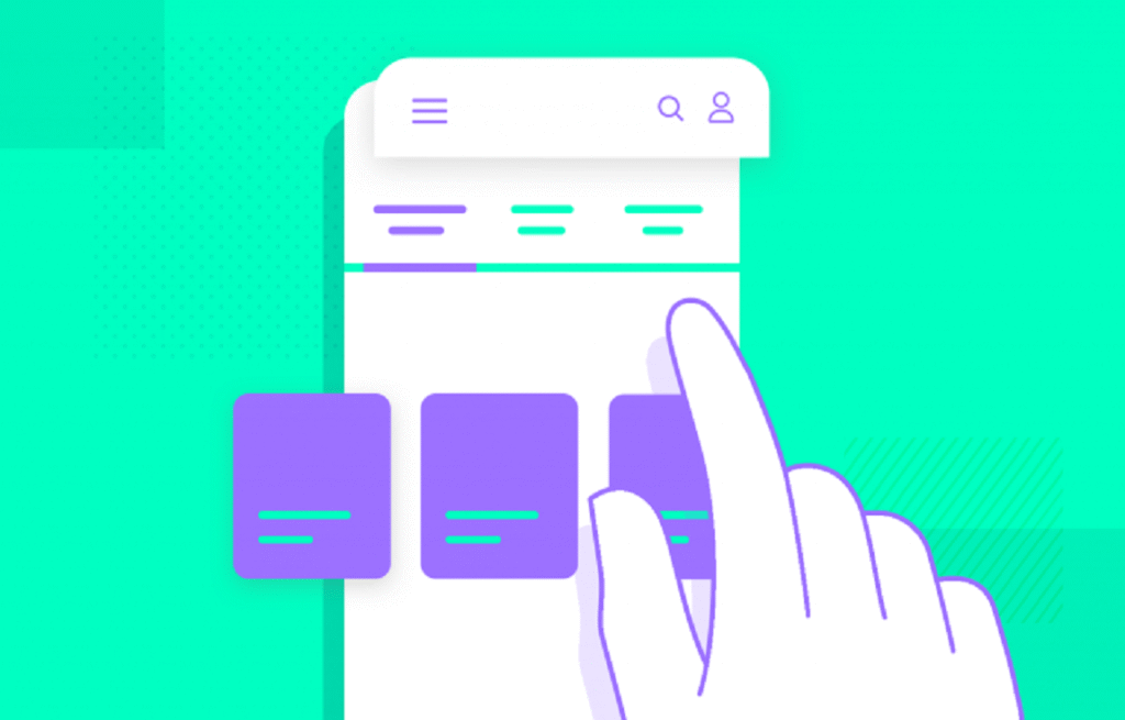
7. Simplified Navigation & Search
Nothing tanks a homepage experience like a cluttered nav bar. Think clean menus, smart categories, and sticky headers.
Include a prominent search bar with predictive results. Reduce decision fatigue with collapsible menus and mega-dropdowns.
Good UX Includes:
- Logical nav hierarchy
- “Shop by need” or “Shop by collection”
- Icon-based menus for mobile
Wrap-Up: Don’t make people guess. Navigation should feel intuitive, not like a puzzle.
8. Personalized Elements & Chatbots
AI is no longer a gimmick. Today’s Shopify stores are layering personalized greetings, exit intent offers, and even product recommendations based on behavior.
Chatbots can greet users with promo codes, suggest products, or help track orders.
Ideas to Implement:
- Personalized pop-ups: “Welcome back! Still looking for…”
- Product rec sliders based on cart
- Chatbot with product finder logic
Wrap-Up: Personal touches aren’t creepy when they’re helpful.
9. Use Subtle Animations & Interaction Cues
Micro-interactions and animations can guide the user without being flashy. Think hover effects, animated loading bars, or icon movement on scroll.
Use these to highlight action points not distract from them.
Design Wins:
- Slide-in CTAs
- Image zoom on hover
- Floating cart icon
Wrap-Up: Movement draws the eye. Just keep it classy.
10. FOMO & Limited-Time Offers
Fear of missing out is a powerful motivator. Countdowns, stock indicators, and limited-time badges boost urgency.
But be honest manufactured scarcity can backfire. Make offers real, clear, and visible above the scroll.
Conversion Tricks:
- “Only 3 left!”
- Countdown timer banners
- Timed welcome offers (“10% off for next 10 mins”)
Wrap-Up: FOMO works best when it feels authentic, not manipulative.
Final Thoughts:
A great Shopify homepage balances beauty, usability, and persuasion. It welcomes visitors, builds trust, and guides them toward purchase without friction. Every element from your hero banner to your footer should have a reason to exist. Don’t settle for “good enough.” Test new layouts. Get feedback. Tweak colors.
Track scroll depth. And most importantly think like your shopper. Need help improving your Shopify homepage? Let’s chat. Drop a comment, share your homepage link, or ask for a review we’re all here to learn.
FAQs
Q1: What should be above the fold on a Shopify homepage?
A clear headline, product-focused image, and a single CTA. First glance = first decision.
Q2: Should I use animation or video?
Yes if it supports your story and doesn’t slow load time.
Q3: How many CTAs are too many?
1–3 primary ones are fine. More than that? Use hierarchy and placement wisely.
Q4: Is mobile more important than desktop in 2025?
Yes. Most users will never see your desktop version first.
Q5: Can I use a free Shopify theme and still convert?
Absolutely. It’s not about fancy it’s about clarity, speed, and strategy.